Visual identity · 2026
Pennelli Grifone Oscar The rebranding
Two marks become one, and the griffin holds a brush in its beak.
- Cliente
- Pennelli Grifone Oscar
- Anno
- 2026
- Ambito
- Visual identity
- Consegna
- Audit of the existing mark, symbol, logotype, corporate colour, strapline
01 Il contesto
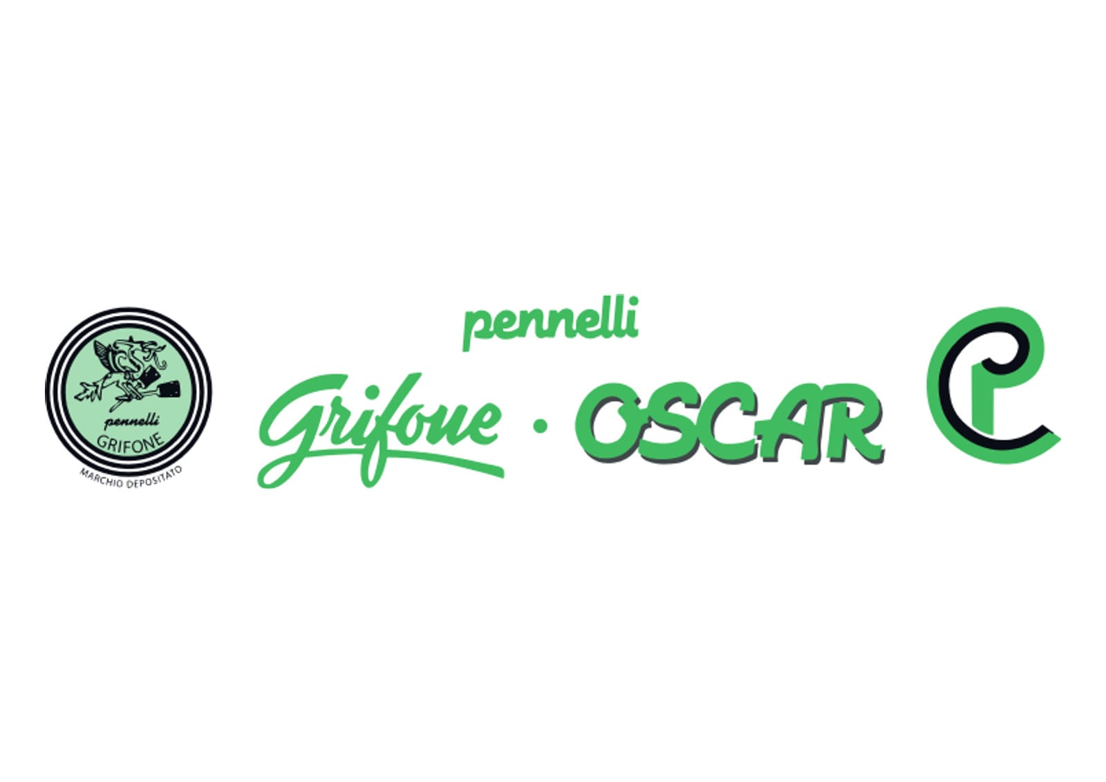
Two different marks lived side by side: a circular seal reading “registered trademark” and an italic wordmark, plus a monogram used as needed. With three signs in circulation none of the three could become memorable, and anyone looking could not tell which one was the company’s logo. The problem was not an aesthetic one, it was one of understanding. And the mark came from an earlier era of graphic design: too much detail for printing small, a stroke that closed up at reduced sizes, and a green tied more to habit than to a decision.
02 Il progetto
Together with the company we made a clean decision: start again rather than touch up. The name already offered the symbol, the griffin, which brings together the eagle and the lion. It only had to be brought to the front instead of being kept inside a seal. From there, five decisions.
- The griffin to the front
- Redrawn from scratch: a solid, pared-back profile, legible even at a few millimetres. It used to be a detail inside a seal; now it is the mark.
- The brush in the beak
- The mark also had to say what the company does, not only what it is called. The griffin grips a brush and holds it with pride: the trade and the craftsman’s pride told in one detail, with no need for explanation.
- Built on a module
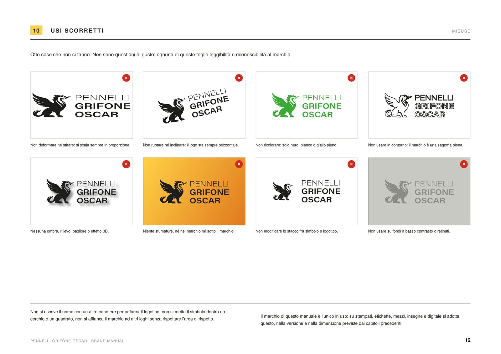
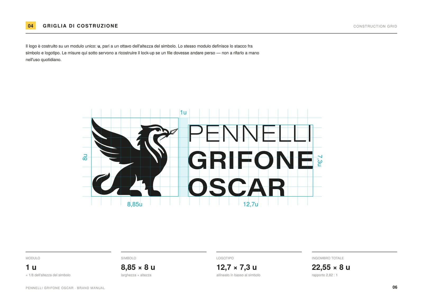
- Every curve sits on a single module, 1u, one eighth of the symbol’s height. The same module sets the gap between symbol and logotype: 8.85 × 8 u for the symbol, 12.7 × 7.3 for the logotype, 22.55 × 8 overall. And a stated minimum: 35 mm across for the horizontal logo, 11 mm for the symbol alone. Below that size the brush in the beak closes up, so we drew a dedicated lock-up.
- From green to yellow
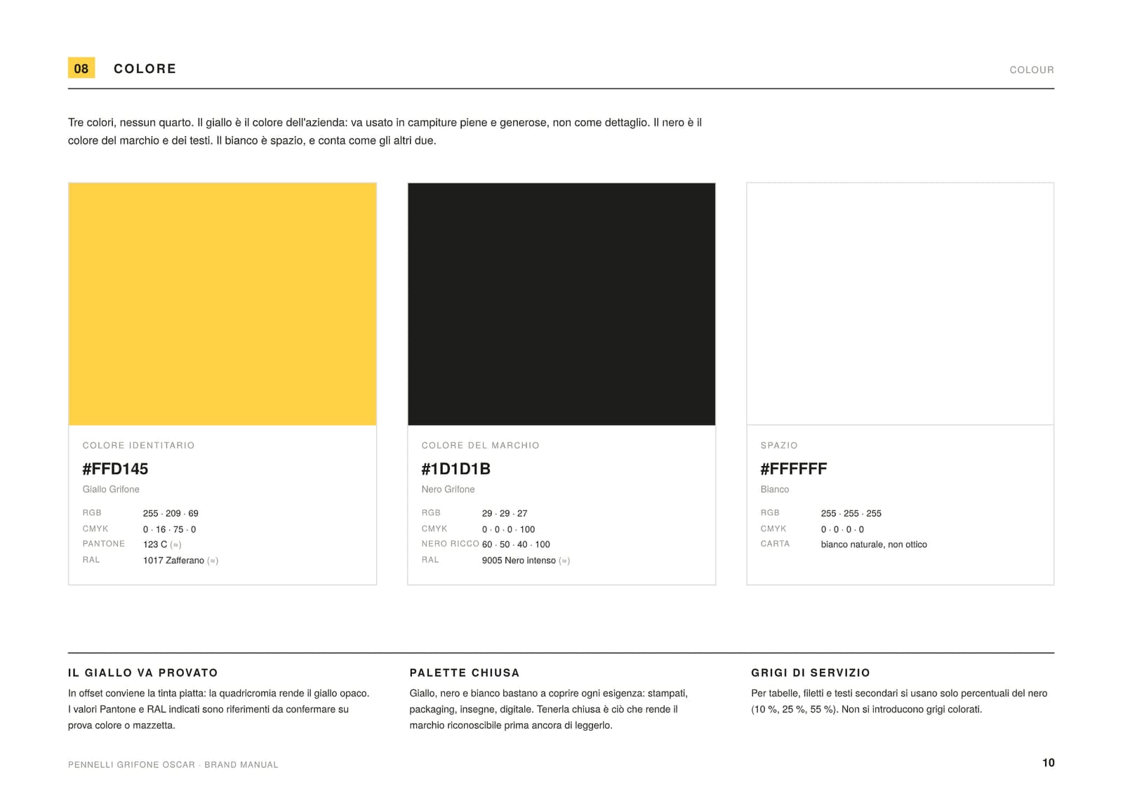
- The bravest decision. Green had been with the company for ever, but it anchored the company to the past and blurred it into half the sector. The yellow #FFD145 recalls the light of gold, and so value and quality, and it gives the greatest contrast with the black of the mark. On a shelf you see it from ten metres.
- The logotype, and the strapline
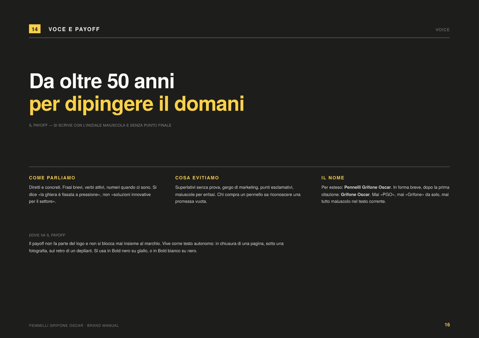
- Linear lettering, all caps, on three lines: PENNELLI, GRIFONE, OSCAR. No shadow, no italic, no effect: the typeface does its job and lets the griffin speak. And a strapline that holds half a century of history and a look ahead together, “Da oltre 50 anni per dipingere il domani”.
03 L’esito
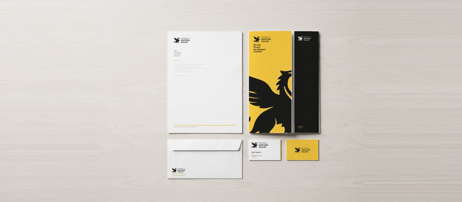
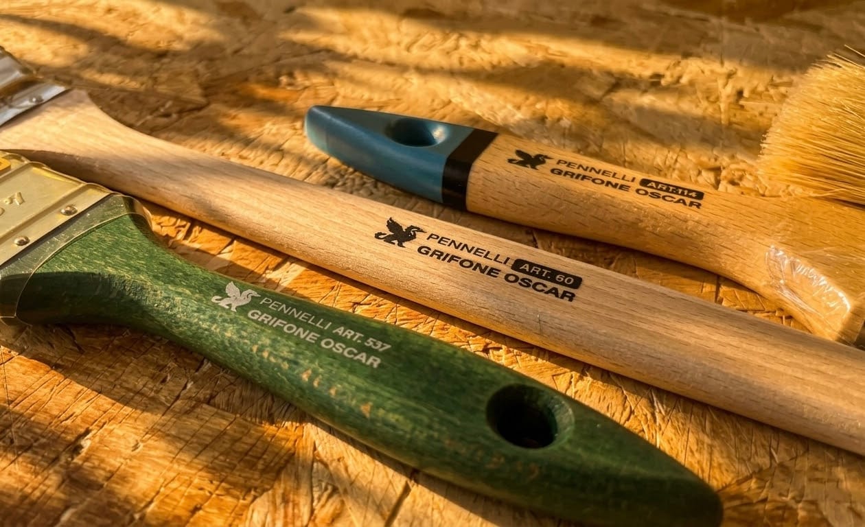
The company now has a single identity: a mark that stands on its own, a logotype for horizontal applications, and a colour that belongs to it. It works on a brush handle and on a building front, and it says who the company is: Italian craftspeople who have been making brushes for fifty years and mean to go on making them well.
Four pages from the manual