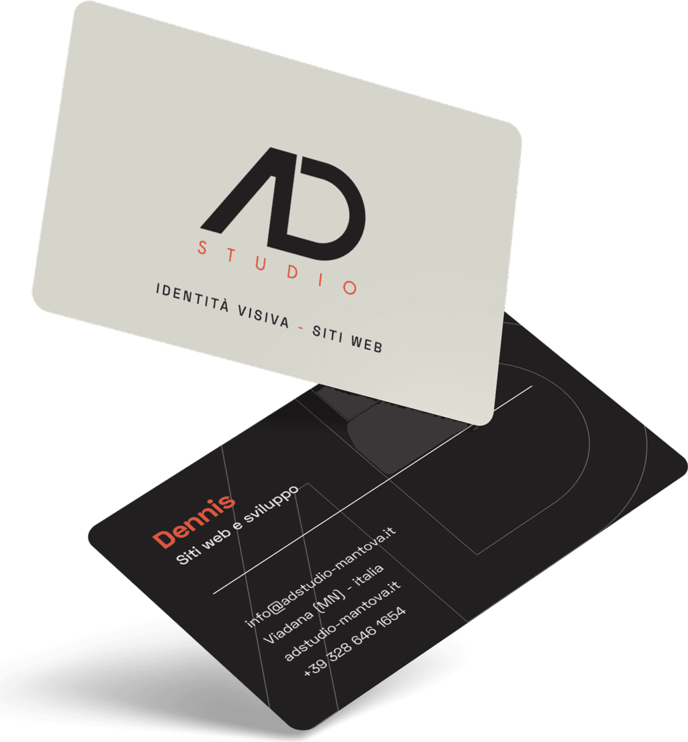
Visual identity · 2026
AD Studio The mark
Two letters that share a stem, and the measurements that define them.
- Cliente
- AD Studio
- Anno
- 2026
- Ambito
- Visual identity
- Consegna
- Mark, geometric construction, rules of use
01 Il contesto
The studio’s mark was our first project. It had to answer to the same conditions we ask of a client’s mark: legible at small sizes, reproducible in a single colour, and defined by rules rather than by one file.
02 Il progetto
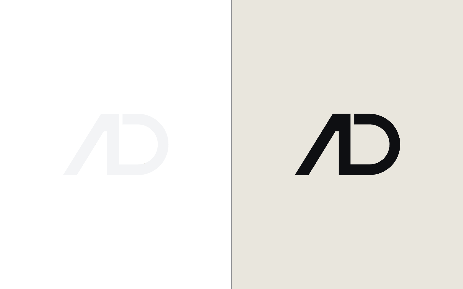
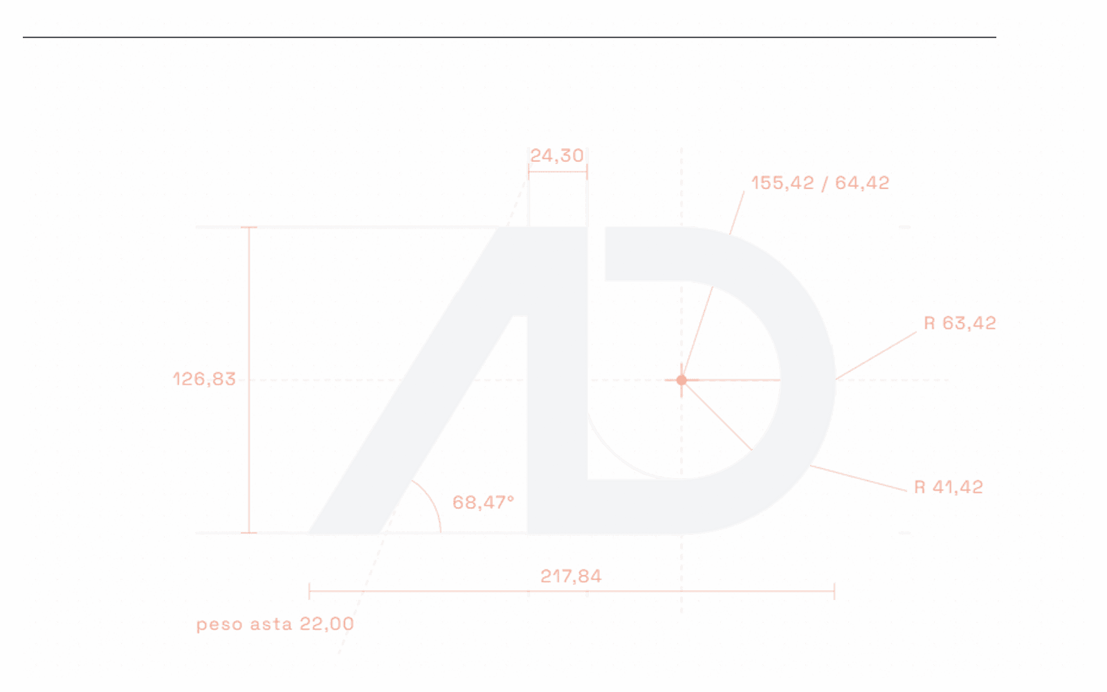
An A and a D that share the vertical stem. The construction is geometric: centre, radii, stem weight and the angle of the diagonal are stated measurements, not proportions found by eye. The same construction drawing is the one the site redraws in the “about us” section.
03 L’esito
The mark reads at a centimetre on a business card and at two metres on a sign. And it is defined by measurements, so anyone can rebuild it identically even without the original file.