All the work
OIRES The brand
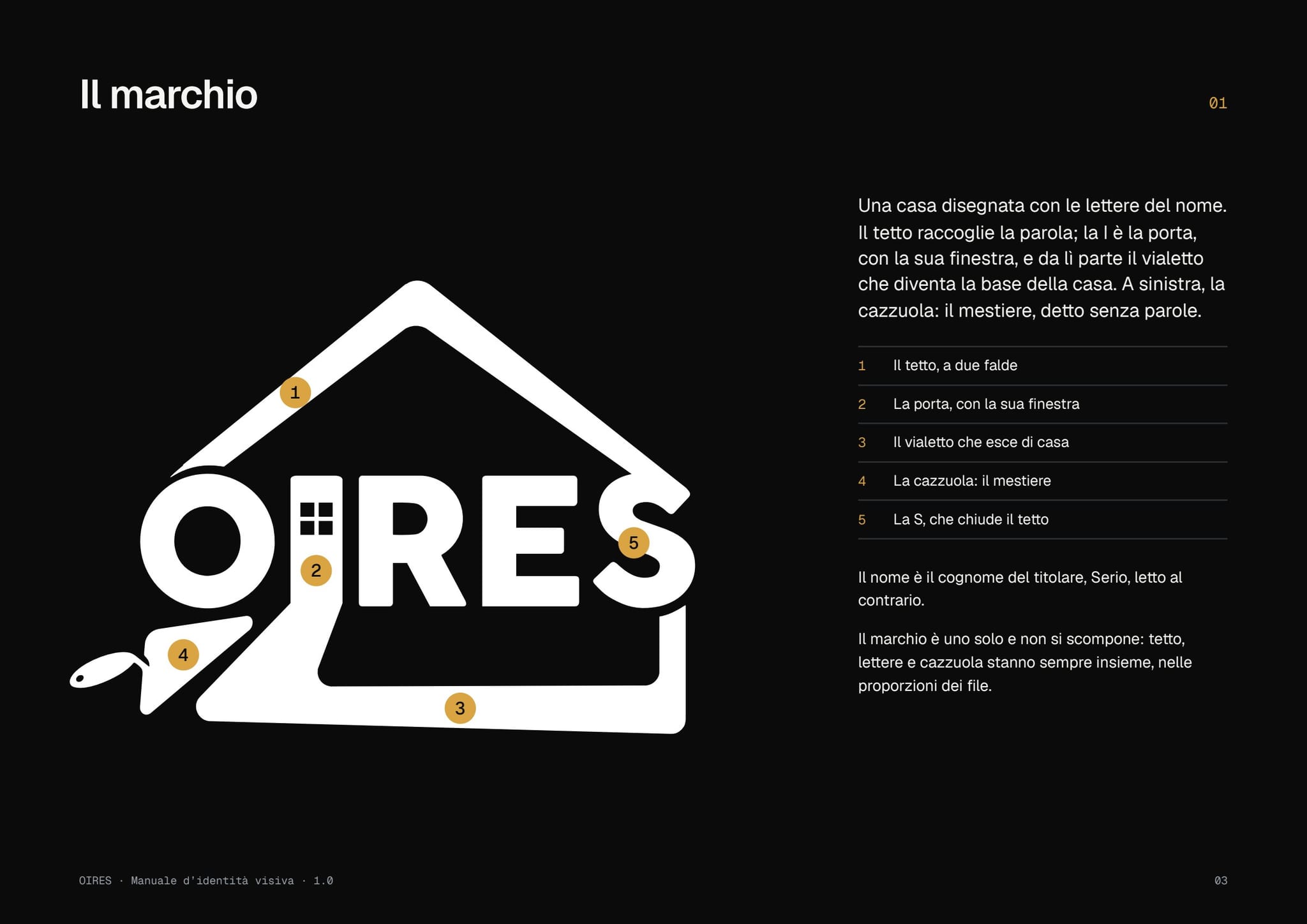
A house drawn with the letters of the name, for a firm that renovates houses.
Identity · 2026
Where we started
A building firm in Viadana that needed a mark people would recognise at first glance.
The logo: a house of letters
The roof gathers the word, the I is the door, and on the left is the trowel.
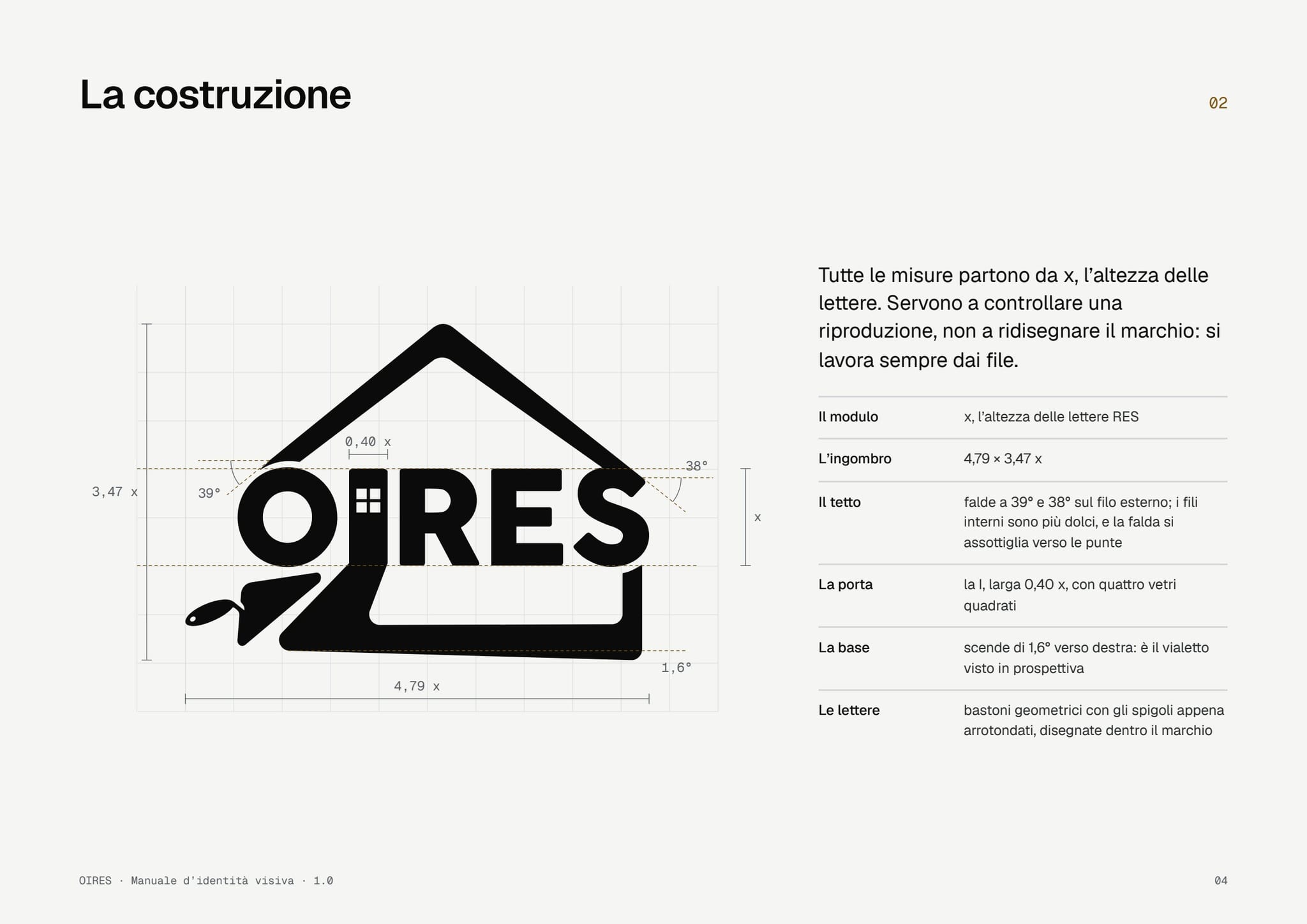
The construction
Everything is in proportion, so the logo reads on a business card as on a scaffolding banner.
Colours and typeface
Black and white for the logo, a sheet-metal grey for the text and a touch of amber, used sparingly.
Black
#0B0B0C · 60%
Bone
#F5F5F3 · 25%
Zinc
#9AA2A9 · 10%
Amber
#D9A441 · 5%
From the business card to the building site
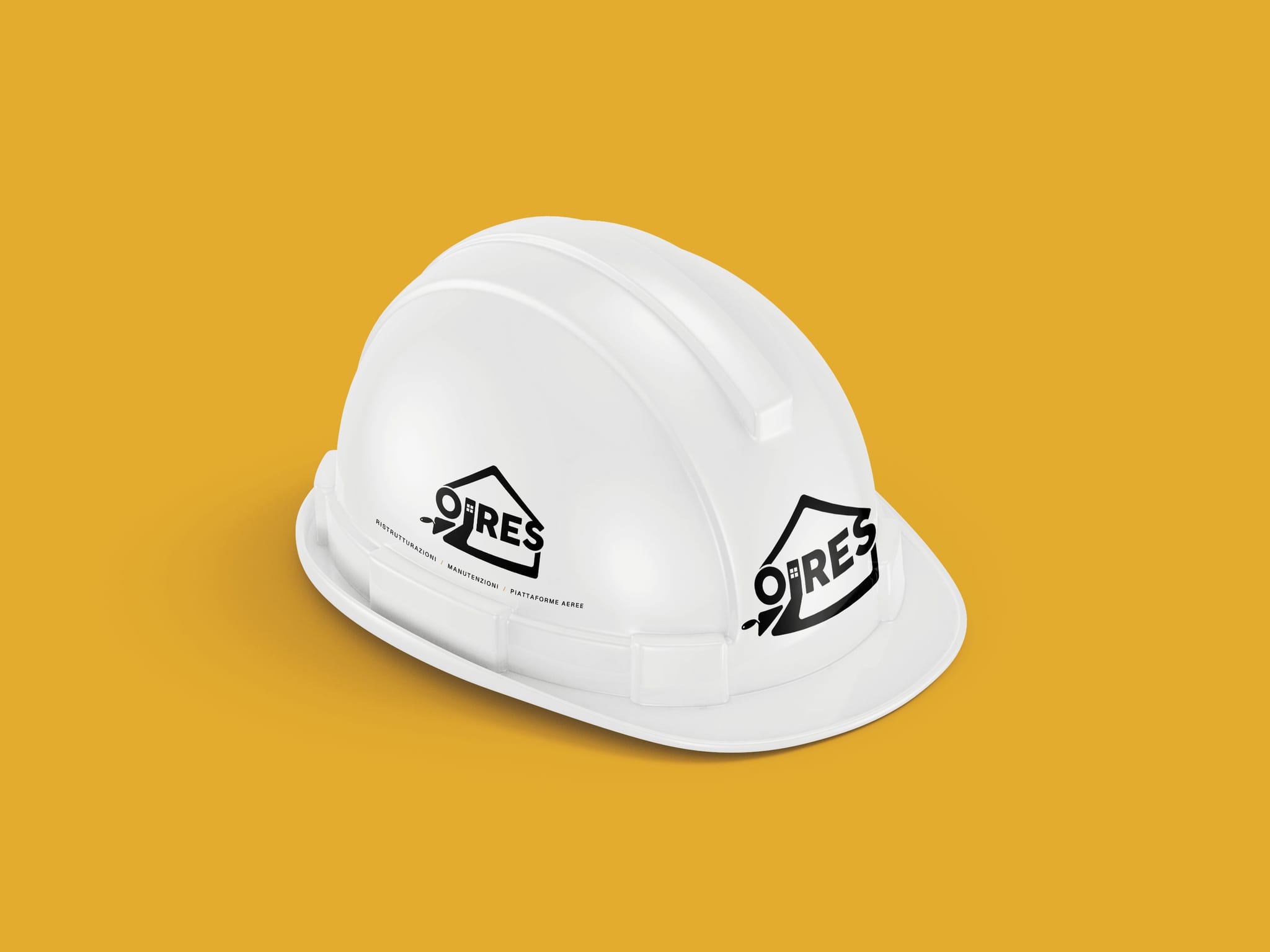
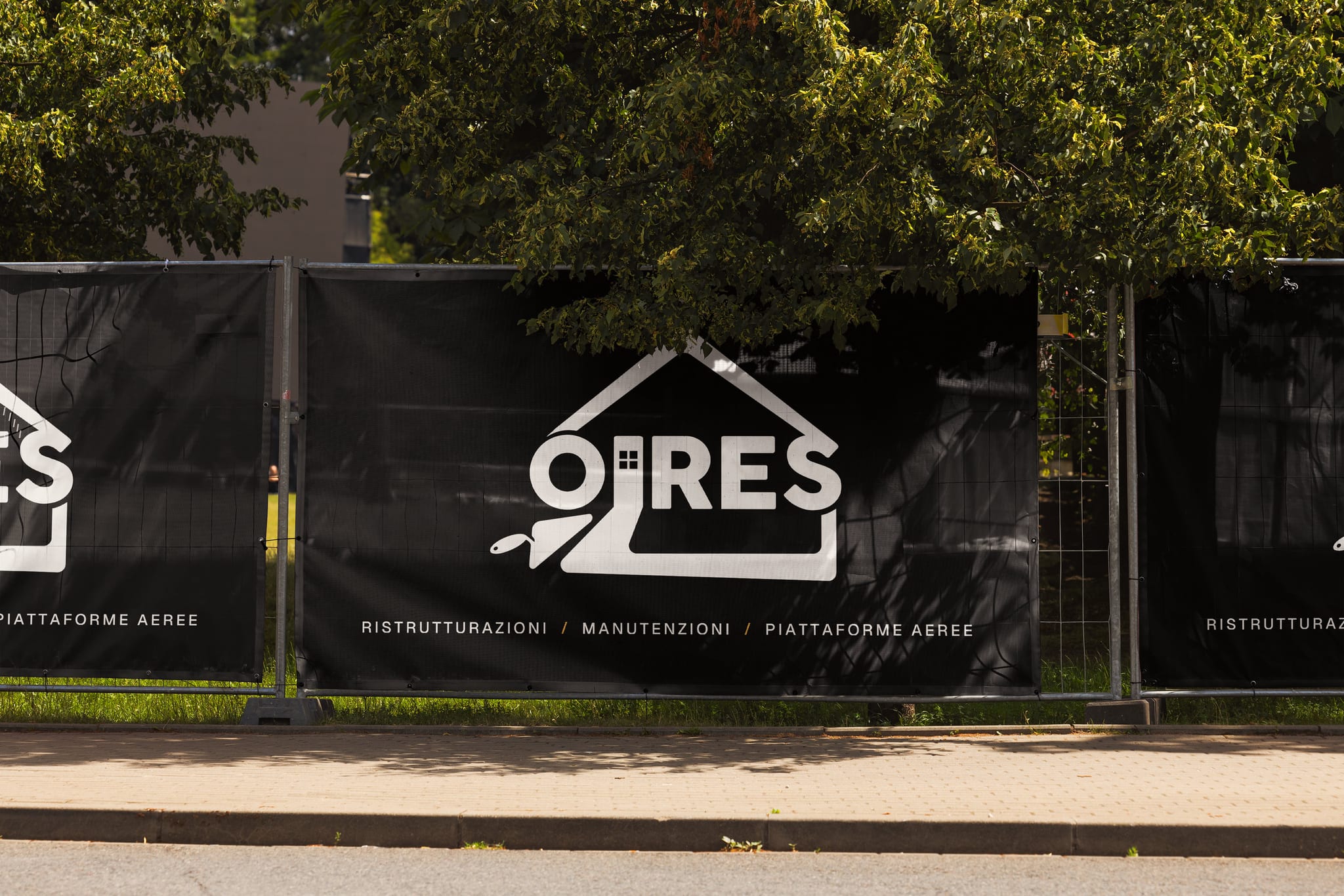
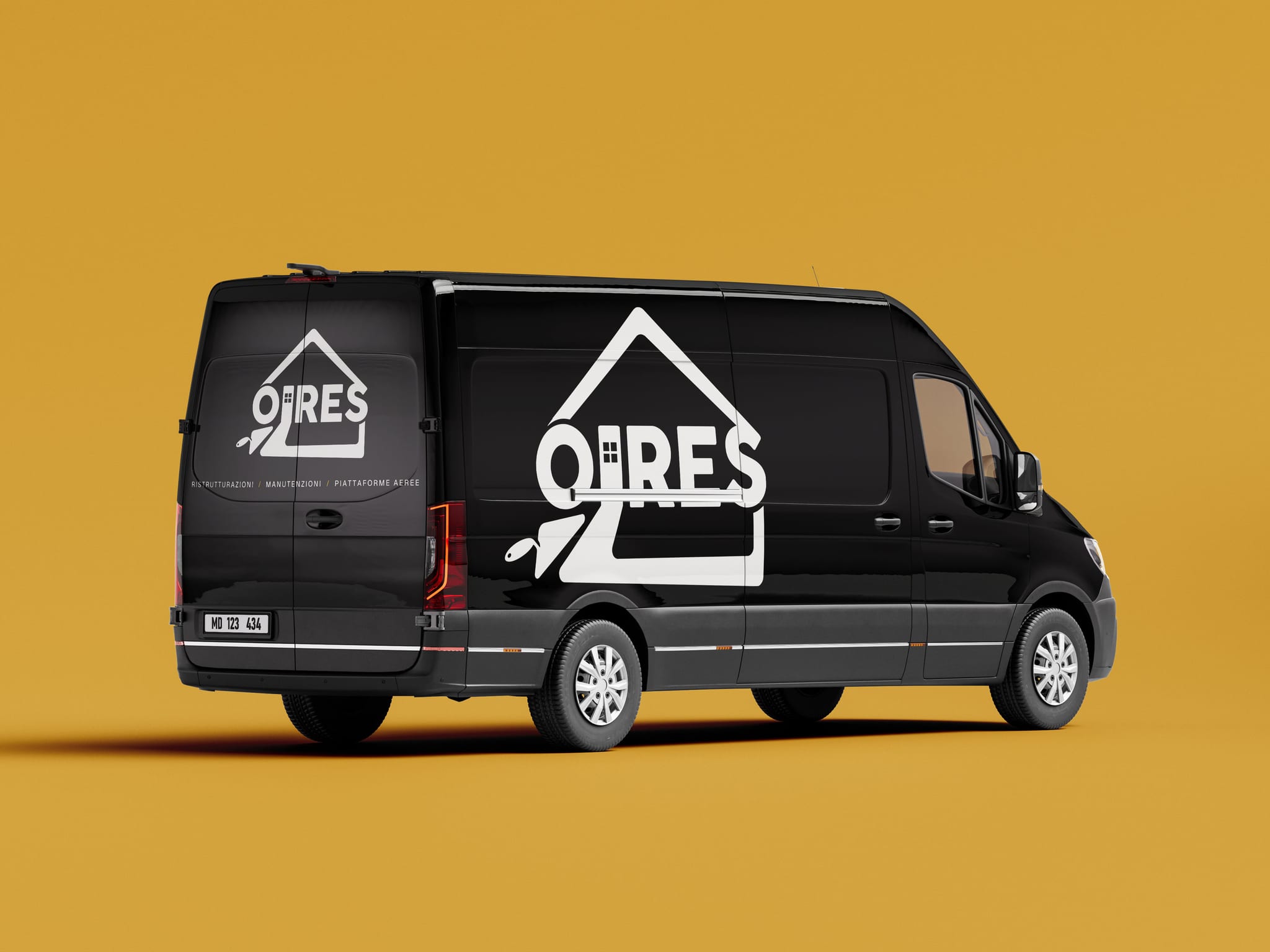
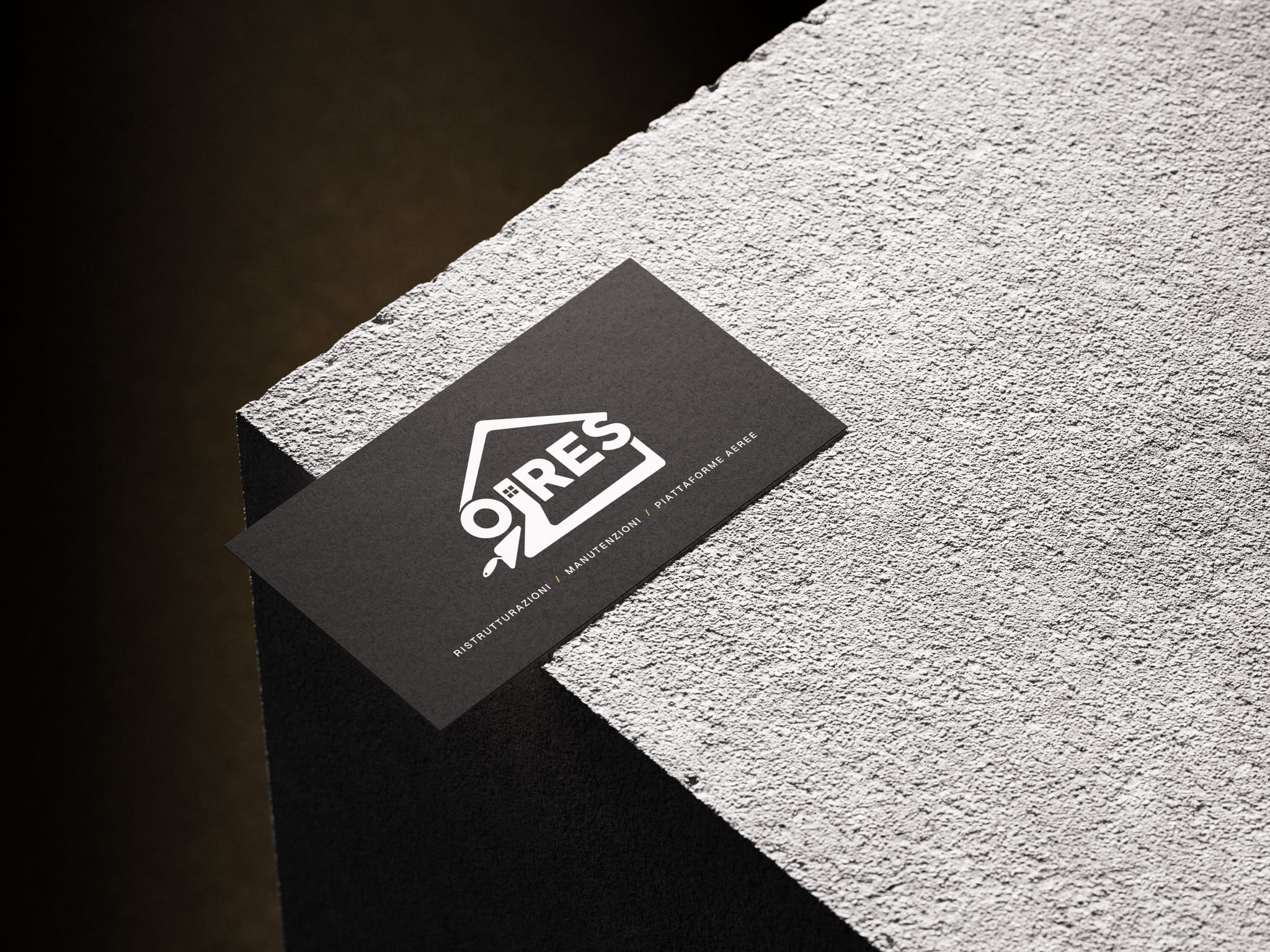
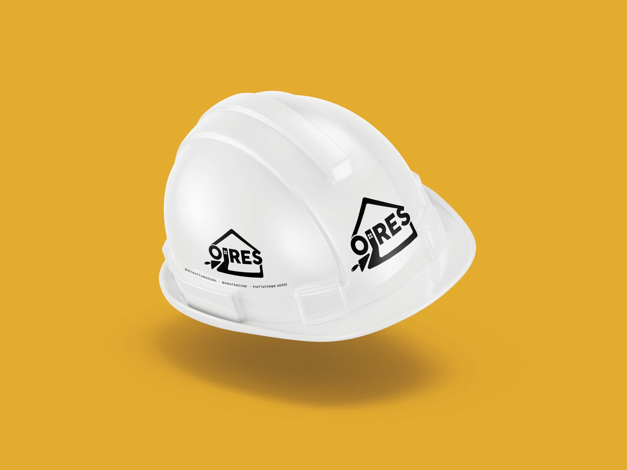
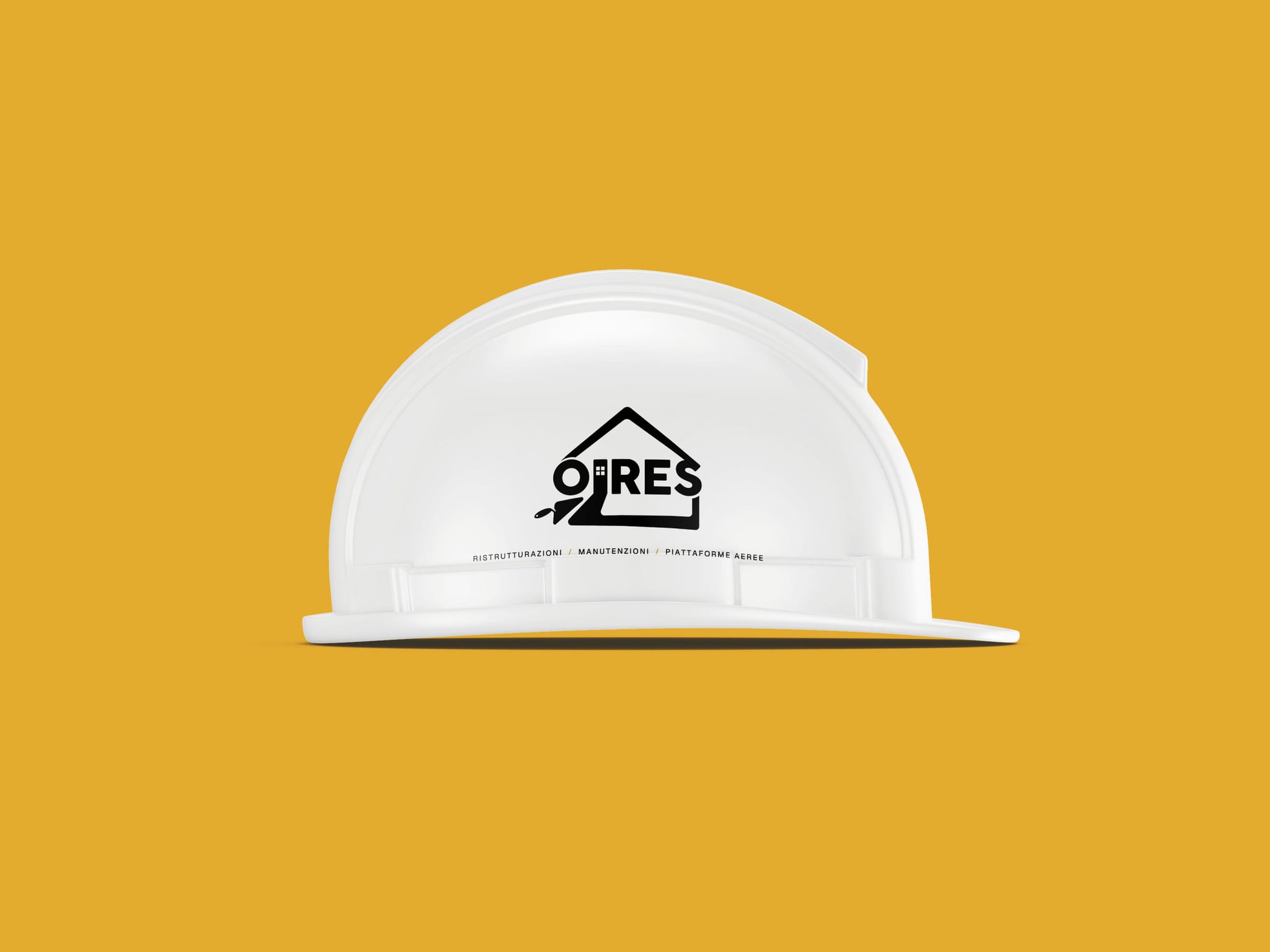
On hard hats, on site banners, on the van and on business cards.
How it went
The logo in the versions it needs, a manual and files ready for the printer.

The next project
Sara Polato
The next project could be yours.
Tell us where you are starting from.
Let’s talk